CSS responsive trick: How to create an "ellipsify" class
THE PROBLEM
When it comes to responsive design, tables are - in the words of Jean-Ralphio - "the wooooorst."
They might look good at first glance, but there's always a pesky email address or two (or 200) that stretches on for 30 characters and staunchly refuses to fit inside its designated space. At Ten Forward, we generally reserve tables for data-heavy, admin-only views, where the primary use case is desktop, not mobile ... but we still want it to not break everything (or look terrible) if an admin visits the page on her phone.
One trick we've adopted to help with some of this is our ellipsify CSS class. It's not a one-size-fixes-all solution, but in specific situations, it's a lifesaver.
THE CODE
.ellipsifyoverflow: hiddentext-overflow: ellipsiswhite-space: nowrap
Just attach the class to whatever div or td or p you expect to have trouble adjusting to less space, and voilà!
THE SOLUTION
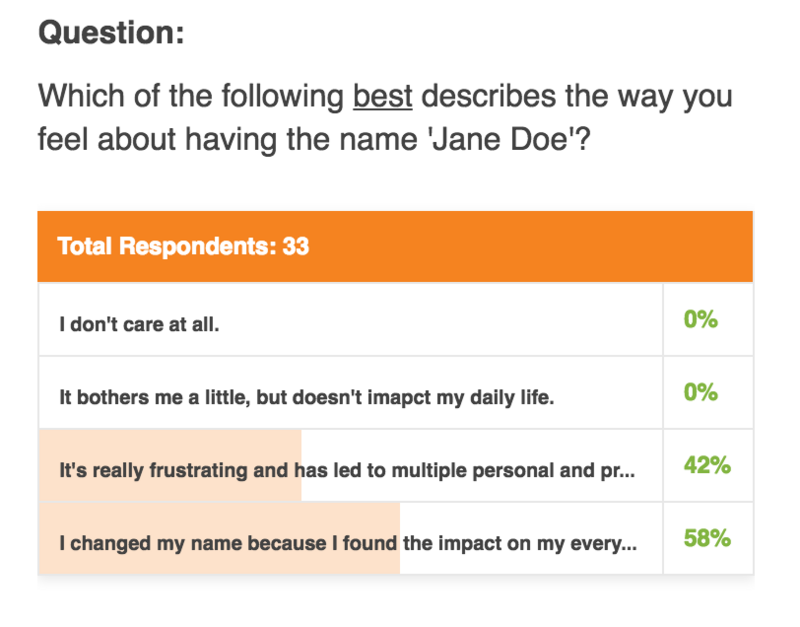
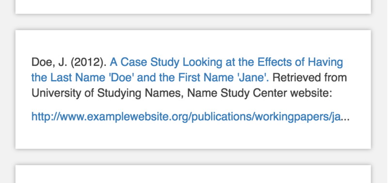
Now, instead of text disappearing or stretching outside its boundaries on mobile or tablet, we get this:
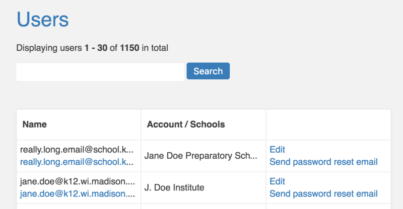
It's important to note that in these examples, the user either:
A) has enough context to interpret the text, even without seeing every character; or
B) is performing an action on the text (clicking a link) rather than interacting with it as content (reading it).
For extra clarity, you can add a title attribute to the element, so that at least on desktop, users can see the full contents when they hover with their mouse.